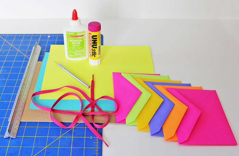
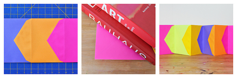
Day-Glo Accordion Book Materials- 6 Astrobright envelopes: 4-3/4″ x 6-1/2″ or similar size. I bought mine at Staples
- Glue stick
- White glue
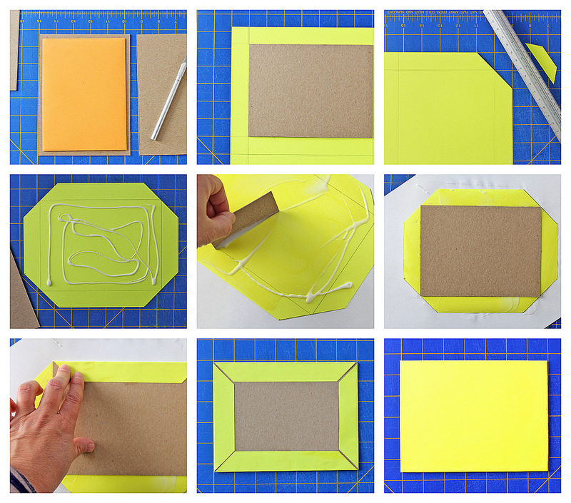
- Lightweight cardboard
- 8 1/2″ x 11″ Astrobright paper
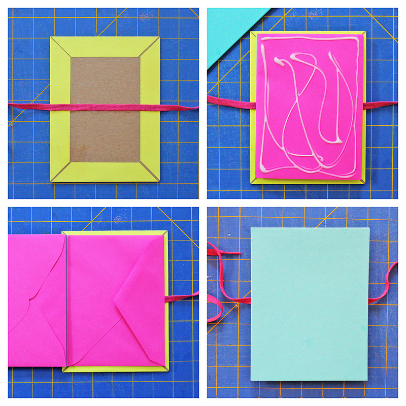
- Ribbon or Shoelace
- Exacto Knife
- Cutting Board
- Straight Edge
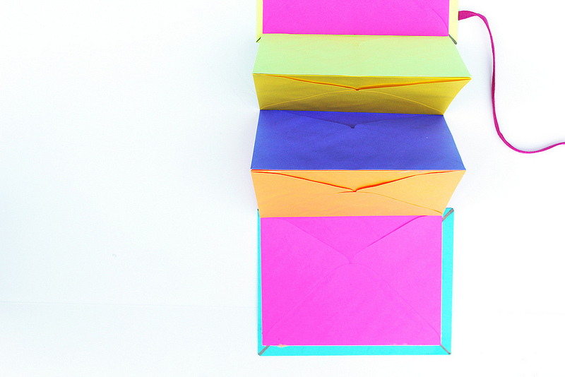
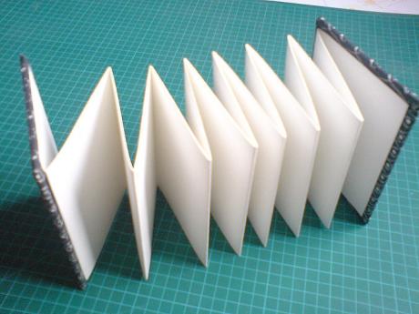
InstructionsPages - Step One Using a glue stick, glue the flap of the first envelope to the front side of another envelope.
- Step Two Continue adding envelopes until they are all adhered together into an accordion.
- Step Three Press envelopes between a few heavy books. Let dry.
Cover - Step One Cut out two cardboard pieces 1/2″ larger than your envelopes.
- Step Two Cut your cover paper. The cover paper should be at least 1″ larger than the cardboard on all four sides. Trim each corner at a 45 degree angle.
- Step Three Spread white glue on the cover sheet and smooth it out evenly across the paper.
- Step Four Place your cardboard in the center of the sheet and fold the flaps over the cardboard edges carefully. The better your 45 degree cuts, the smaller a gap you’ll have at the corners, obviously I could have done better on this step!
- Step Five Press between some books until the glue dries.
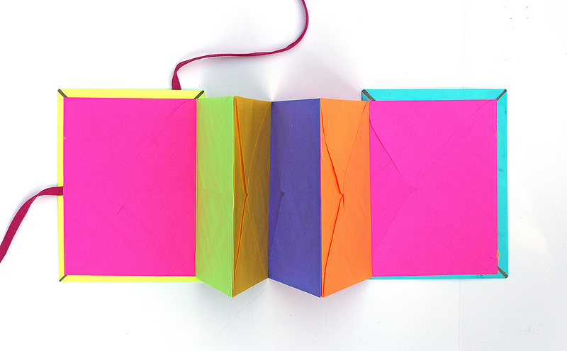
Book Assembly - Step One Center the ribbon on one of the cover sheets and glue it to the cardboard.
- Step Two Spread glue over the front side of one of the end envelopes in your accordion. Turn it over, center on cardboard cover, and press together. Make sure to clean up any excess glue that may squeeze out.
- Step Three Glue the second cover sheet to the front side of the last envelope on the other end of the accordion. Clean up excess glue so you do not accidentally glue any of your pages together.
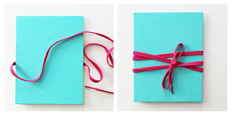
- Step Four Press the whole assembly between some heavy books and let dry.
You’re done! What can you use this little ditty for? All the odds and ends of everyday life: business cards, receipts, to-do lists etc. Kids can use it for stickers, tattoos, collections or organization projects. Get creative and burn brightly!
http://babbledabbledo.com/diy-books-day-glo-accordian-book/
Here is a video showing step to step guide on how to make Japanese Stab Binding Tortoise Stitch, that i found. Just considering different ideas for my final book.
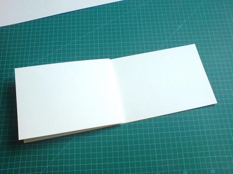
Today's make is for an easy accordian fold sketchbook or photo album... You will need:- Large sheet of acid free watercolour paper (or paper of your choice)
- PVA glue
- scalpel or craft knife
- greyboard or other thick card
- decorative paper or fabric
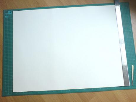
Step 1This is a simple but versatile accordian book that, depending on the materials you use, makes a beautiful photo album, or with a little imagination an original and unusual journal. First you need to prepare your pages. I've started with a large (nearly A1) sheet of bockingford watercolour paper and cut it into 4 equal strips. This will make 2 or 4 small note books / journals.
Step 2
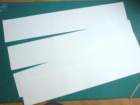
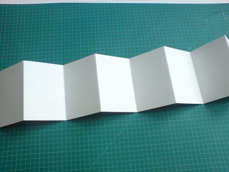
Fold each strip into half and half again and so on until you have useable sized pages. Step 3
I want quite a thick book so I've pasted 2 strips together but you could just use one strip on it's own. Paste glue on one end page of one strip and place it directly over the end page of the other strip and stick! Step 4
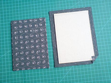
Cut two pieces of board that are about 5 mm bigger around the edge of the page size (1 cm total) and decorate them with paper or fabric of your choice. I've gone for an embroidered indian paper. Remember to allow a 1 cm edge to fold over the edge of the board that will show when you glue the pages.
Step 5
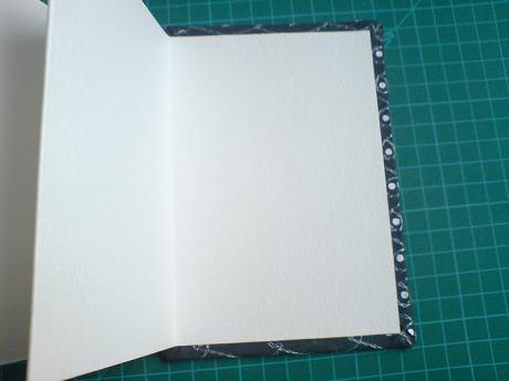
Paste the end paper of your strip carefully on to the centre of the inside of the board, then the other side and there we are - done! If you have used PVA you should stick the finished book between boards and a pile of books until it's dried, that way it will dry flat and give it a more professional finish. Oh and don't forget to add a ribbon or cord to hold it all together. http://ukhandmade.co.uk/content/make-easy-accordian-sketchbook
Artists' books are works of art realised in the form of a book. They are often published in small editions, though sometimes they are produced as one-of-a-kind objects referred to as "uniques". Artists' books have employed a wide range of forms, including scrolls, fold-outs, concertinas or loose items contained in a box as well as bound printed sheet. Artists have been active in printing and book production for centuries, but the artist's book is primarily a late 20th-century form. "Artists' books are books or book-like objects over the final appearance of which an artist has had a high degree of control; where the book is intended as a work of art in itself." Stephen Bury
This is an article that i found giving tips and techniques on how to publish my own book by Karen Inglis. I thought this was very helpful and gave a well explained instructions on what she did with her children's book.
Source: http://kareninglis.wordpress.com/self-publishing-a-childrens-picture-book/ Picture book publishing basics – what I’ve learned Below I look at the practicalities of self-publishing a picture book. If you’re looking for creative guidance skip down to the end of the page for links.
1. Picture book page and word countMost picture books are 32 pages and 500-1,000 words long. (Word count can of course vary from very few right up to 1,000 – but the golden rule is generally less is best.) The second most common page count is 24 pages. If these lengths don’t suit your story, then any multiple of four will work but bear in mind that 24- and 32-page books are tried and tested and will sit comfortably alongside the competition in a bookshops.
For planning purposes, these page count numbers exclude the back and front cover butinclude ‘end pages’ such as title page, dedication and so on – this is important to understand when mapping out your story as it means you probably have only 24 -28 pages to play with for a 32-page picture book, depending on how you want to use your end pages. (I got this wrong first time around!)
2. Picture book storyboardingThis is working out on one piece of paper how your story – the pictures and the words – will flow through the book. A storyboard is an essential first planning step before going on to make up a full size dummy. It gives you a birds’ eye view of where your text and illustrations will sit and makes it easy to see what is and isn’t working. Because you are working at a high level it’s also relatively quick to make changes, using revised storyboards if necessary. This is much more sensible than to trying to work with a full mock-up at the outset, no matter how sure you think you are of your story flow! (Another mistake I made!)

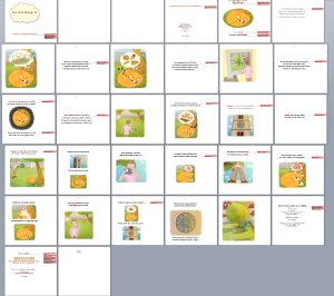
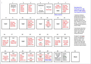
32-page colour picture book storyboard
Practical tips for storyboarding your children’s picture book(This tips are based on my personal experience. I am not an illustrator, but I briefed my artist quite closely on all required pictures as I had a strong sense of what I wanted – we work well together this way!)
Tip 1: Before starting, take a look at the competition
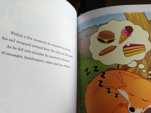
I borrowed a lot of picture books from the local library and rummaged around in the loft for old favourites we’ve kept, such as Hairy Maclary. I was interested to study not just how the publishers had placed and interwoven the text and illustrations, but also to see how they had used their end pages (title page, half title etc). What’s acceptable, such as inclusion of illustrations with copyright info, and the sequence in which the title page appears seems to be pretty flexible! I have a fun double page collage spread at the start of Ferdinand Fox’s Big Sleep – it features a lot of the food we later see Ferdinand dreaming about, offering additional discussion and learning opportunities. I got the idea for this from some of the books I looked at.
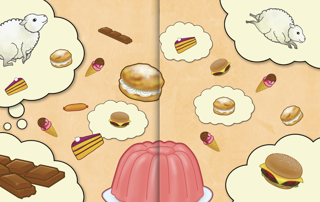
Opening collage – lots to see and talk about!
Tip 2 : Be ready to compromise!Ferdinand Fox’s Big Sleep is 436 words long and made up of 13 sets of four-line rhyming verse. I had a reasonably clear idea of what pictures would go with which text as they had always played naturally in my head. However, because I wanted to make my book fit the traditional 32-page model , when I came to do the storyboard I had to cut planned pictures in some places (no room!) and include unplanned pictures in other places (to avoid a text-only page). I also had to change my ‘master plan’! I had initially envisaged text on the left-hand page and an image on the right-hand page throughout – as with Hairy Maclary. However, it soon became clear that this wouldn’t work all the way through – not just because of page-count restrictions, but also because the varying pace of the story demanded more frequent pictures in some places than in others. Having the high level storyboard was a must for solving these challenges. Tip 3: Put yourself in your reader’s shoesTo ensure that you end up with an engaging spread of images and words put yourself in the reader’s shoes (parent/adult and child) and constantly ask yourself: - ‘Is the variety and mix of illustrations/words from one page to the next sufficient to keep readers – and watchers – engaged?’
- ‘Do all pages offer opportunities for questions, discussion, thought, laughter, pointing and/or learning?’
- ‘Is the story progressing at an acceptable pace visually and/or through the words?’(This doesn’t mean it needs to be a fast pace, of course – that will depend on the story!)
We all know which books we read to our children that we enjoyed and returned to again and again – and I can certainly remember some that I found boring! Keep these common-sense questions in mind when planning your storyboard. They will help you know when it’s right! Tip 4: Make use of colour codingOn a first run with your storyboard, perhaps use a coloured cross or blob to indicate where you feel that an illustration is needed – be that on the same page as the text or on a facing page. You could also vary the size of your blobs or crosses to indicate the nature and size of each illustration (small, medium, large, close-up shot/full scene etc). I am no artist but I certainly found this approach came naturally and gave me an immediate sense of the book’s visual balance. Once you’re happy that the mix feels right and the text will fit, create a second version where you either sketch the image crudely, or (if , like me, you’re not an illustrator!) use colour text to describe the image needed. I’ve typed out the storyboard below to make it easy to read here – but of course you actually do this by hand. This board shows how the book finally turned out.

My storyboard with image notes & colour text
3. Creating a dummy / mock-upOnce you are 99% certain that you have your story mapped correctly, mock it up with A4 paper cut to the page size you will be using (read more on page size below). This will enable you to leaf through the book and get the real ‘reader experience’ – and gives you a last chance to be absolutely sure that the pace of the story and mix of illustrations feels right. If it doesn’t you may need to return to your storyboard – or you may be able to make minor adjustments on your mock-up.
Tip: Once you have your images files you can also mock a dummy up on-screen in Word and then reduce the view to 10% to give you the same birds’ eye view as the story board. I did this as a final step before sending the file for layout by my formatter. See below for how it looked. The red marks are instructions I had included for him with the file.
NB The double page spreads below are not displaying as they would for reading because the first page you see is actually a right hand page – but you can fudge this for your own use, which I did from recollection!
Snapshot of layout using Word & final images
4. Picture book paper size The paper size options available to you will depend on how you intend printing and distributing your book. If planning to use one of the main print-on-demand and distribution services, such as CreateSpace, Lightening Source or Lulu, check to see what paper size they offer and then compare that with equivalent books to your own in your local library or bookshop. Aim to go for the same size or similar (unless, of course, you want your book to stand out by being different!). You can then price accordingly and work out your RRP.
However – before steaming ahead – decide what interior paper quality you want and can afford! The main print-on-demand options are convenient and will take care of distribution, but four-colour books don’t come cheap using this method and the finish means they may not be suitable for your children’s picture book. Read on to find out why….
5. Interior paper finish using print on demandThe hardest lesson I learned from producing Ferdinand Fox’s Big Sleep is that I couldn’t get a silk finish interior paper finish from CreateSpace or Lightening Source. This is the slightly heavier, sticky-finger-proof paper used in most children’s books – yet neither services supplies them.
My reading of their product specs made me think this was a given – but it was my mistake and it threw my pricing and distribution plans into disarray at the last minute. This is crucial to understand if you intend trying to place your book into children’s bricks and mortar bookshops because 90% of picture books (in the UK at least) have these thicker silky pages.
This is not to say that you’ll get a poor quality product from CreateSpace or Lightening Source – you won’t. If you choose white paper it is smart and looks and feels very good (almost silky!) – and the quality of interior colour is excellent from both. (I opted for Lightening Source’s Premium Colour option, though there is a cheaper one available.) Nevertheless my heart sank when I opened my proof copies because I had expected silk paper.
Lightening Source matt paper interior – great colour!
Talking with parents/friends and even our local librarian they all said they couldn’t understand why I would think about ordering books upfront just to improve the interior paper finish, as they hadn’t noticed anything ‘wrong’ with my proofs. You probably can’t either looking at the picture above. On that basis I think that if you only intend selling direct from Amazon the quality is absolutely fine – and I am selling this version through them. (I checked with Nielsen who said that I didn’t have to use a different ISBN just because the paper finish was slightly different.) But if you want to try to persuade wholesalers to stock your book – to give you quick access to bookshops nationwide – you are likely to have difficulty due to the finish, especially as an unknown author. This said, provided you have a great book, your local bookshops may well take the matt format on consignment and you can still sell it directly via Amazon and other online stores. At the time of wrting, Lulu did supply silk finish paper – but only for book sizes 12” x 12” or 12.75” x 10.75” which are not typical for children’s books. Also this size / finish of books is not eligible for distribution via Lulu. 6. Print on demand costs for colour picture booksBe aware that the unit cost of print on demand colour picture books is high – despite the ‘non-silk’ interior paper quality. For example, the unit cost for printing a copy of Ferdinand Fox’s Big Sleep on demand is £3.21! As I normally offer a 45% discount through Lightening Source – in order to increase the chances of online stores discounting my books – that leaves me with a profit of just 60p per sale on Amazon sales, against £1.37 per sale on my other print books. This is liveable with, though not ideal! But I was still keen to find a way to produce a silk finish version to supply through wholesalers. In so doing, my aim was to try to match the print on demand price with the shortest print run I could find. 7. Traditional print cost quotesI used to buy in print many years go and was therefore not surprised (but still horrified!) to learn that in order to bring my unit print costs close to the print on demand cost of £3.21, I would need to spend at least £1,500 and order in a stock of 500 books. Or I could reduce the unit cost further by paying around £1,900 for £1,000 copies. (With traditional offset printing, the higher the print run the cheaper the unit cost and vice versa, due to the print set-up costs.) Ordering in 1,000 copies would clearly make more economic sense, but without a sales force or national PR campaign behind me to drive custom, this was not a risk that I wanted to take – neither was spending £1,500 on the initial shorter run! 8. My compromise –short digital print runsLuckily I was able find a print firm that could supply me in runs of 100 off their digital press – working out at £3.40 a book including delivery, which is not much more than the production cost using Lightening Source to produce the non-silk-finish version. Yes, this meant I had to order up front – laying out £340 – but it meant I could test the silk finish version with local bookshops, at school events and via my wholesaler without ordering in huge numbers at considerable expense. With a retail price of £6.99 my silk finish versions still make a reasonable return of £3.60 at school events (or £2.60 if I offer a £1 discount) as there is no distributor cut taken. And I still make money from consignment sales with local bookshops where I tend to offer 35% discount. However, where I don’t make any money (my accountant now needs to close his eyes!) is through my wholesale sales via Gardners, whom I supply direct on a 50% discount agreement. (Believe it or not, this is good discount for a self-publisher by today’s standards – they only agreed to it on the back of my historic sales of The Secret Lake and Eeek! The Runaway Alien.) Gardners understandably advised me to market the book at £7.99 instead of its current £6.99 price. However, I didn’t feel I could justify this – especially alongside so many picture books by well-known authors at a lower price point. I therefore settled for the £6.99 on the basis that my main profits from sales will be made through school events and local consignment sales. In the meantime, having the book in stock at Gardners – who are listed on Nielsen as my main distributor – means that most UK bookshops and online stores (WH Smith’s, Waterstones etc) can order it in easily and quickly, offering more chances to test it in the market. This strategy has already assured Ferdinand Fox’s Big Sleep a listing on the respected LoveReading4KidsUK website – where it was selected by Julia Eccleshare, Children’s editor at The Guardian, as one of July 2013′s featured books.
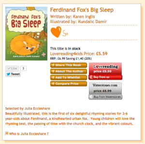
Chosen by Julia Eccleshare of The Guardian for Age 5+
9. My long-term marketing and distribution strategy for FerdinandMy test marketing of Ferdiand Fox’s Big Sleep has gone far better than I dared hope and I’ve sold around 150 copies at the time of writing – half through Waterstones events and most of the rest through school events in May/June and or local bookshops on consignment. At both the Waterstones signings and the school events the feedback has been brilliant – children, teachers and parents love the rhyming text! And most children have seen urban foxes so are keen to try to make up their own stories! I’ve also sold a small number online. The online reviews (some from a Goodreads giveway) have been fantastic (and all but one of these were from the non-silk finish version supplied through Amazon) – including another 5 Stars from Louise Jordan, the ex-head Reader at Puffin UK and founder of The Writers’ Advice Centre for Children’s Books. Should sales /orders take off in any large numbers as the book becomes more well-known through school events and my own PR, then I will consider ordering in a much larger print run using the offset method to bring down the unit cost and only supplying this finish – or approaching a partnership company such as Matador, to work with. But for now it’s wait and see, live and learn! I am also under no illusion that picture books don’t ever sell in very large numbers! I have more school events planned for the autumn and will be doing more publicity then too, so will then make decisions from there. 10. Ferdinand Fox’s Big Sleep Colouring Book – another way!We indie authors are known for our resourcefulness, and as I pondered my lessons learned from this project, I had the idea to produce a colouring book version of Ferdiannd Fox’s Big Sleep. This uses standard black and white matt interior pages, so can be produced using print on demand at a much lower unit cost than the four-colour book.
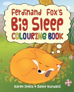
Available on Amazon
Here readers get two for the price of one – a rhyming story and an activity book! My hope is that over time this will produce a further income stream, to help justify the cost of the project to date. Luckily my illustrator works directly in MS Paint, which meant it was very easy for him to resupply the images to me in black and white outline only. Also the format of the book, with text and pictures sitting separately from one another, lends itself to a colouring book format. To keep costs to a minimum I made no changes to the layout, and simply tweaked the cover text and back page blurb.

A rhyming story & colouring book in one!
I now offer Ferdinand Fox’s Big Sleep Colouring Book via Lightening Source at a RRP of £4.99 – and at the time of writing this was discounted to £4.93 on Amazon, probably thanks to my 45% discount. I make £1.08 per sale with the distribution taken care of for me. I also offer it via CreateSpace in the USA.
I have yet to market this version actively as I want to give the full colour version more of an airing first – but my local bookshops and local Waterstones who stock all of my other books have said they will stock it, and I will supply direct for this. I may also look at packaging them together at a special price. All on my ‘to do’ list!
ConclusionWould I print up-front using silk finish paper again?I have five more Ferdinand Fox Stories and my jury is still out on how I will produce the remaining ones. Provided I book in regular school visits I have no doubt that I can sell my current stock. And since I also include The Secret Lake and Eeek! The Runaway Alien in my school visits (seeing several year groups at a time) it is an effective use of my time. However, I’ll make a final decision on what format to use for the other fox stories sometime next year once I see how the current book fares.
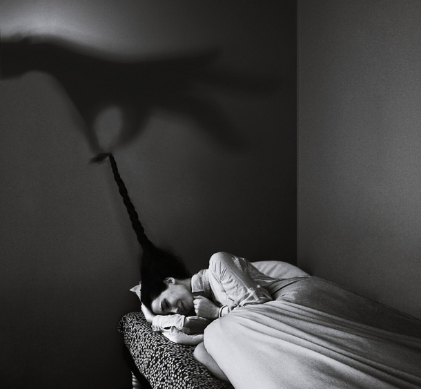
Conceptual photography is an art of getting your ‘concept’ across the mind of the viewer using just the contents of a photograph. It is a genre of photography where a photographer puts various things in the scenery so that his idea or concept becomes clear to perceive. Most of the times, computers are used for blending various objects into a photograph, but many photographers just use what is available to them. Some photographers just make sure that everything they need in the photograph is already available tangibly to them in the scene, while others put the object in-place using PhotoShop or other similar tools. Whatever the technique, conceptual photography is known to be one of the most creative genre of photography. Partly because it is harder as compared to other genres, but mostly because it takes a lot of time and patience to get that perfect conceptual shot. Conceptual photography makes healthy use of graphical symbols to represent ideas, movements, moods, anything and everything that the photographer might want to include in the message of their photograph. Symbols with strong, well-established connotations are usually used, from racy red lipstick to a bleeding heart, shamrocks and clovers to a green dollar bill. The conceptual photographs don’t fail at what they were taken for, that is getting the photographer’s concept across the mind of viewers. Here are a few examples of those: 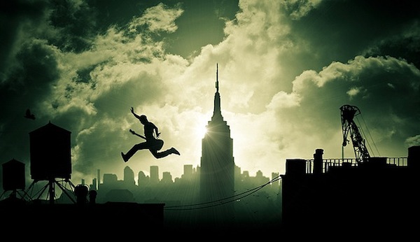 Air Guitar by Dylan Kitchener 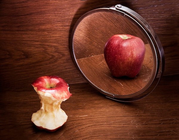 Anorexia by Aanty Ago 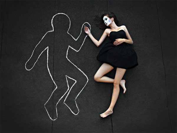 I miss you, by Alice. 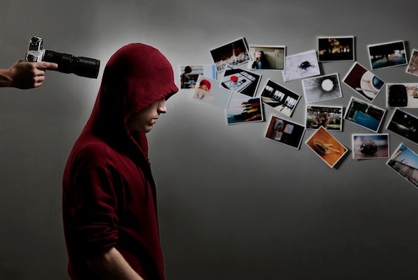 A Creative Mess by Austin 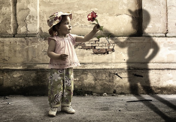 Shyness by Alin Petrus 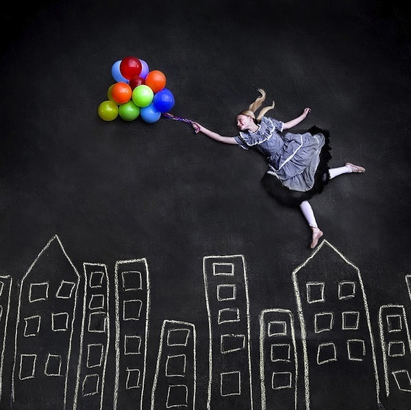 Flying on the Rooftops Jennifer 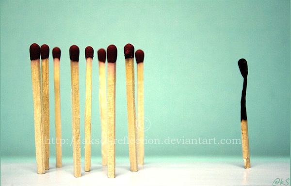 Racism… Conceptual Photography by AksdaReflection. 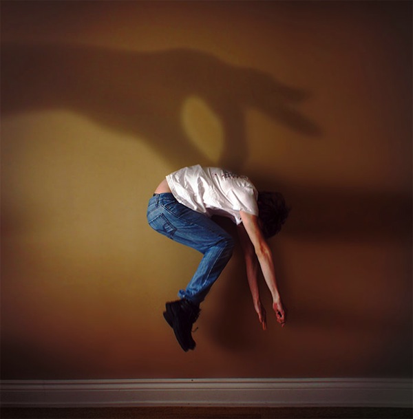 Hanging from Shadow by ForgottenX 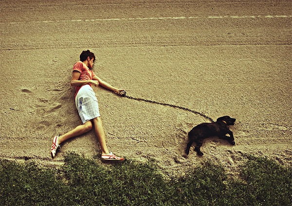 Sleepwalkers by SmallVillian Source: http://dpshots.com/photo-inspiration/conceptual-photography.html
Here is an article I found that i just wanted to share.
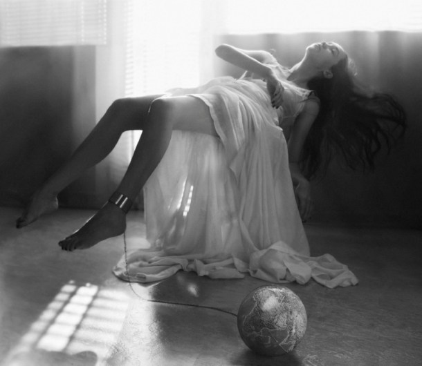
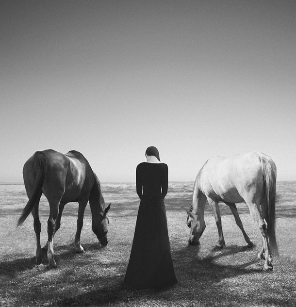
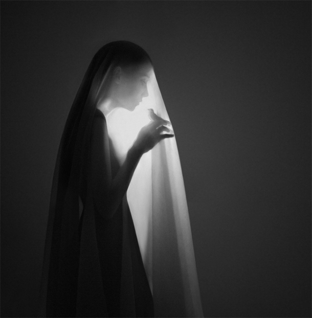
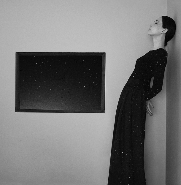
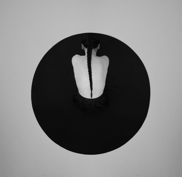
Conceptual Photography- Noell S. Oszvald’s Noell S. Oszvald’s photography is truly mesmerizing, uniquely thought-provoking and very emotional. Her portfolio consists of black & white photos as Noell would like to avoid every distraction from her images and her way of capturing and visualizing an idea or a concept tells tons of stories. Thoughts triggered in the viewer’s mind reflect his or her current state of mind: sometimes it is sadness and loneliness, sometimes it is fear, other times it is peace of mind and security – but in a quiet and pure (or sometimes haunting manner) all of them convey the overall message: how fragile life is. At least this is my own interpretation, and please feel free to develop your own personal connection with Noell’s art pieces.
Noell S. Oszvald – Hungarian photo artist in her early 20s – made her debut only about a year ago. Her images are self-portraits and her field is conceptual photography. Noell’s way of communication fits perfectly to the elegantly fragile world of her images as we will probably never find any explanation from her – the most might be a title, if at all. Noell leaves us viewers enough space to develop our own story enabling a special bond between the artist and the viewer, even we do not know each other personally.
“Earlier I used to draw a lot, but I always had the feeling that I am not particularly talented in this field and I was never able to express myself completely on paper. After a while I felt more & more attracted to photography, film, and digital painting and I saw an opportunity here to create and implement my ideas in a visual way” - says the talented artist, whose humbleness and respect toward her own work and genre, as well as to her environment is incredible.
Inspiration and development of concepts is obviously one of the key elements during Noell’s creation process. “I very much love to read and watch movies, and I can draw significant inspiration from both sources, however the most important for me are my personal impressions and experience combined with ideas that come while listening to music.” Despite of her young age, Noell’s portfolio is already extremely powerful and stunning, and yes, it leaves the viewer staring and thinking for hours, while developing emotions.
Source of images: Noell S. Oszvald’s courtesy.
. . . and now please open your mind and take your time to immerse in a selection of Noell’s art pieces:
DEFINITION: A visual narrative is a story told primarily through the use of visual media. The story may be told using still photography, illustration, or video, and can be enhanced with graphics, music, voice and other audio. The term "visual narrative" has been used to describe several genres of visual storytelling, from news and information ( photojournalism, the photo essay, the documentary film) to entertainment (art, movies, television, comic books, the graphic novel). In short, any kind of a story, told visually, is a visual narrative. The visual narrative has also been of interest to the academic community as scholars, thinkers and educators have sought to understand the impact and power of image and narrative in individuals and societies. Distinguishing characteristics of the visual narrative include: - a persuasive story with a point of view
- high quality images, still or moving
- subject matter with pressing social, environmental, or spiritual value
- an appeal (explicit or implicit) for transformation in attitudes and behaviours.
Source: http://en.wikipedia.org/wiki/Visual_narrative
Here is a presentation I found on Various examples of Visual ways of story telling. This Explores the basics of how images communicate. Looks at various types of visual narratives.
What Is A Visual Narrative?
A visual narrative is a type of story that is told primarily or entirely through visual media, such as photographs, illustrations, or video. There are no restrictions on the types of narratives that can be made in a visual manner — a visual narrative can be fiction or nonfiction of any genre. Some such narratives are even used primarily for practical purposes in order to communicate the same ideas to speakers of different languages. In general, a great deal of emphasis is placed on the quality and organization of the visual elements in visual narratives, as those elements are responsible for communicating the story to "readers." The visual aspects may, in some cases, be supplemented by text or audio, but the emphasis must remain firmly on the visual elements for the narrative to be considered primarily visual in nature. Visual narrative as a storytelling style allows for a great deal of variety in methodology and presentation. Such a narrative could take the form of a film, a graphic novel or comic book, or simply a series of images. Even within these categories, artists and storytellers have a great deal of space for experimentation. The broad category of "visual narrative" allows storytellers to try to tell stories from many different angles and to use a wide range of methods to communicate various aspects of the narrative. Written narratives and visual narratives have a great deal in common in that they usually have similar goals. A visual narrative is always intended to communicate a story of some form, just as a written story is. In many cases, a visual narrative, like its written counterpart, is used to communicate the values and ideals of the artist or storyteller as well. They also tend to use similar plot elements, such as complex characters, conflicts, and transformative events leading to the further development of the characters. Though the visual narrative does primarily rely on images to communicate ideas, many such narratives incorporate other media in order to enrich the story. Films, for instance, often rely heavily on speech and other audio components, even though most of the action is visual in nature. Similarly, though a graphic novel is a form of visual narrative and relies primarily on images, important elements such as dialogue are presented in the form of text. Though many visual narratives do incorporate or rely on other media, some storytellers and artists prefer to communicate their narratives entirely through the use of images. Such a narrative, well prepared and presented, can be as complex and information rich as any film or written story. Source link: (http://www.wisegeek.com/what-is-a-visual-narrative.htm)  Comics are examples of Visual Narratives. Using Photography to Create Visual Narratives.
Cig will be sharing her work and creative process. Her photographs are intertwined with a rich narrative and autobiography, she uses the medium of photography as a way to tell stories.
Cig Harvey's photographs have been exhibited widely and are in the permanent collections of major museums, including the Museum of Fine Arts, Houston, and the International Museum of Photography, George Eastman House, Rochester, NY. She was a recent finalist for the prestigious BMW Prize at Paris Photo and had her first solo museum show at The Stenersen Museum, Oslo, Norway, in the spring of 2012 in conjunction with the release of her monograph You Look At Me Like An Emergency, Schilt Publishing, 2012. Cig's devotion to visual storytelling has lead to innovative international campaigns and features with, New York Magazine, Harpers Bazaar Japan, Kate Spade and Bloomingdales.
Below is a video I found on Youtube Video where she goes more into depth.
Here is a link to her website where there are more examples of visual narratives.
CIG HARVEY'S WORK
http://www.cigharvey.com
|
 RSS Feed